
Product Finder
The Problem SpaceHow might we help new visitors find the right products faster?
This question initiated the Commerce team’s Product Finder initiative. At the time, there were no onboarding or guided flows for first-time visitors. New users landed on the site without context or direction, which contributed to confusion and early abandonment.
Early Insights
Commerce analytics revealed a significant drop-off among first-time visitors. Data showed that new users were being routed directly into the broader site experience without any introduction, product framing, or guidance. As a result, many users lacked the confidence or clarity needed to explore further, creating friction in the early stages of the journey and posing a risk to conversion.
Working closely with Commerce Team Leads, I analyzed existing data to better understand where users were disengaging and how this lack of guidance affected adjacent areas of the business. This research helped define the scope of the problem and informed where a guided entry point could reduce friction for new users

RESEARCH
Comparable Experiences with Unification in Mind
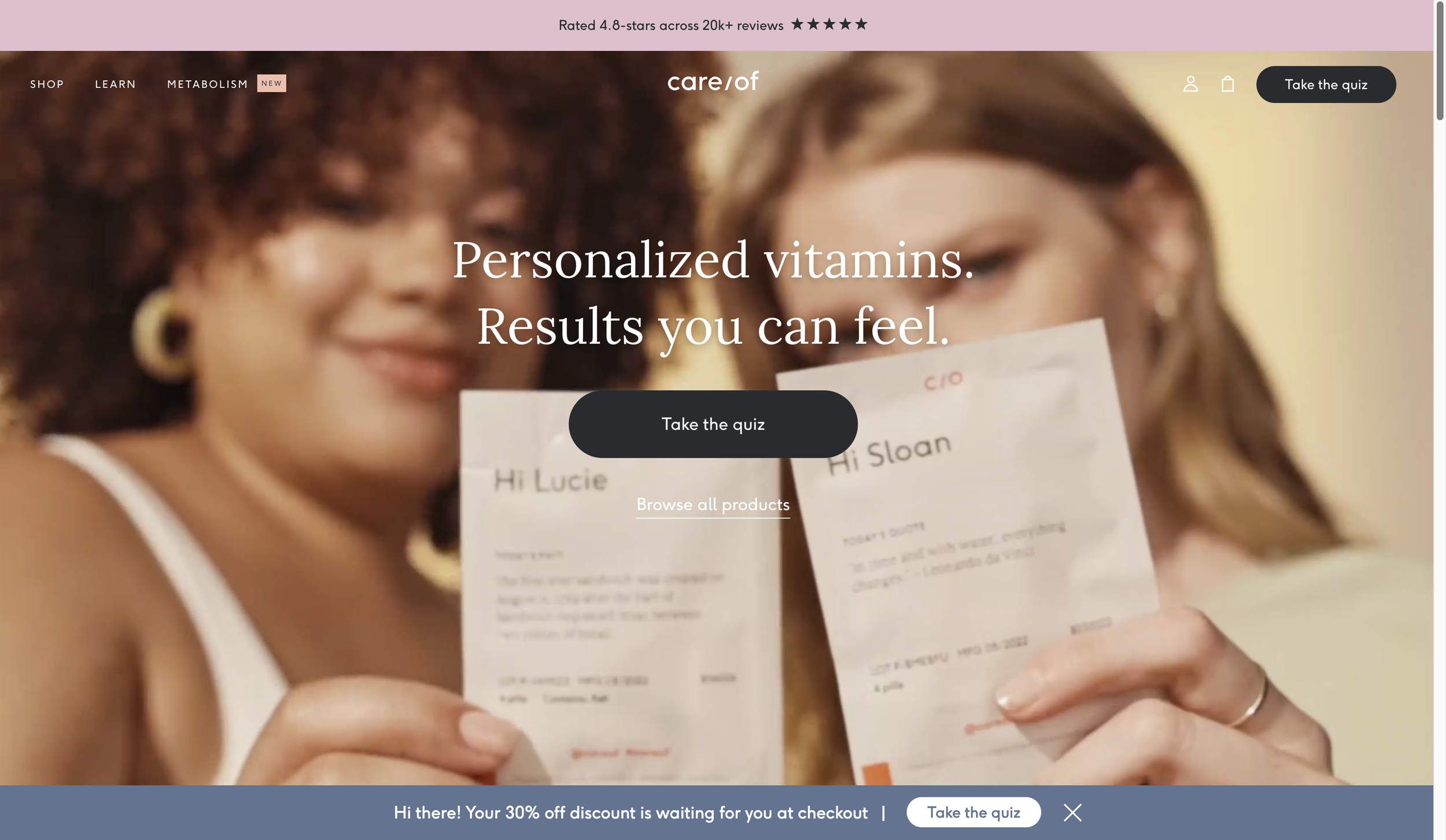
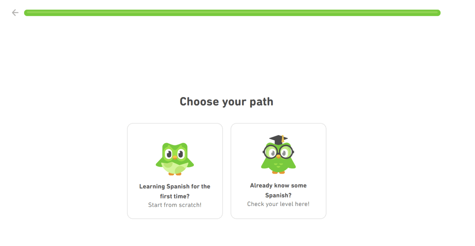
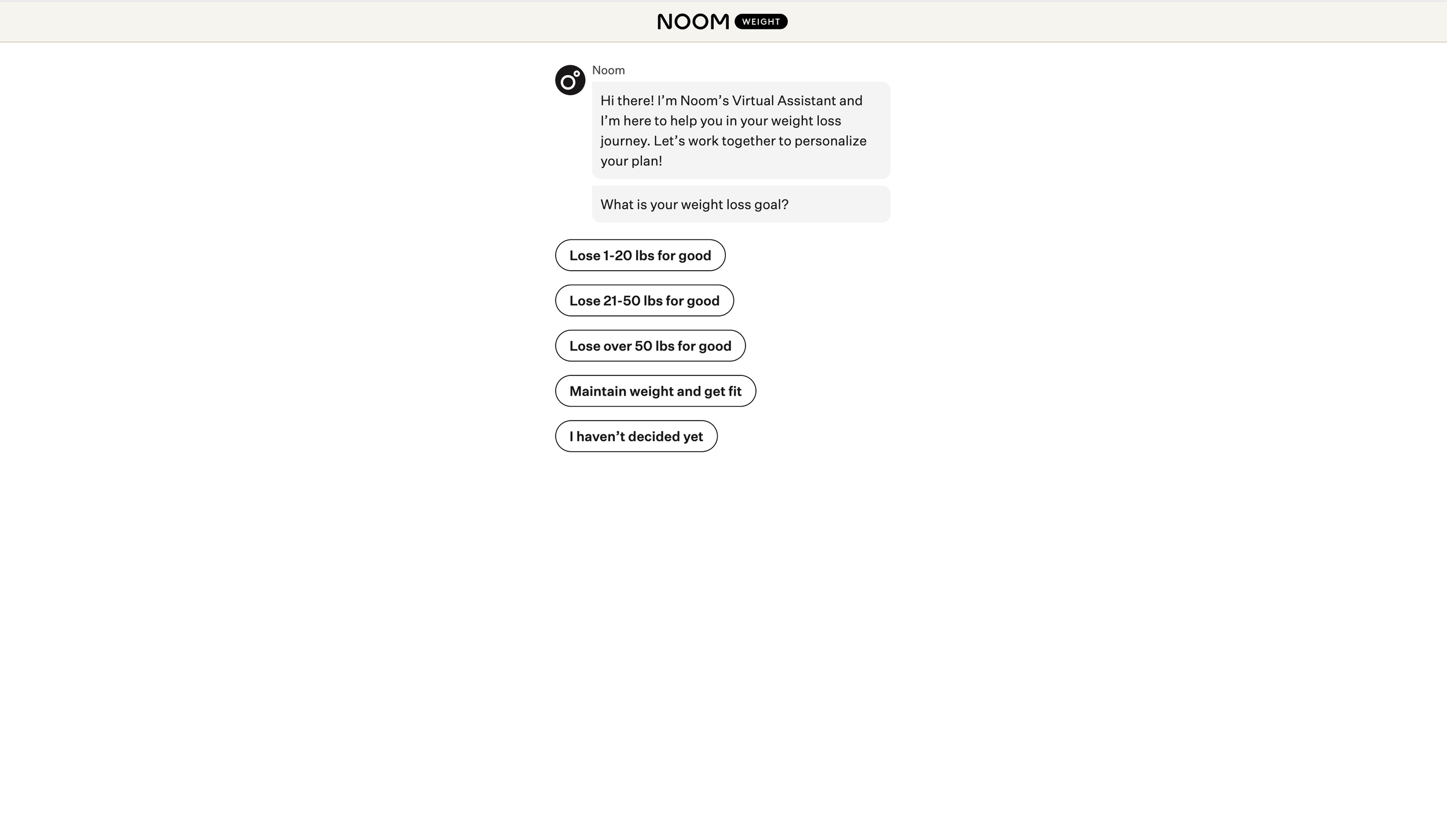
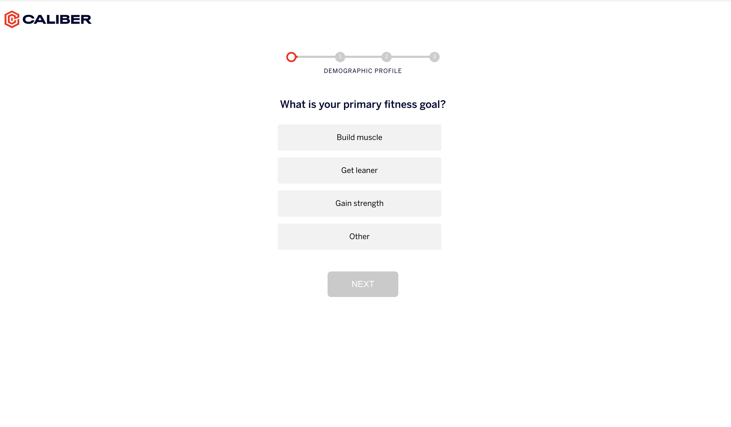
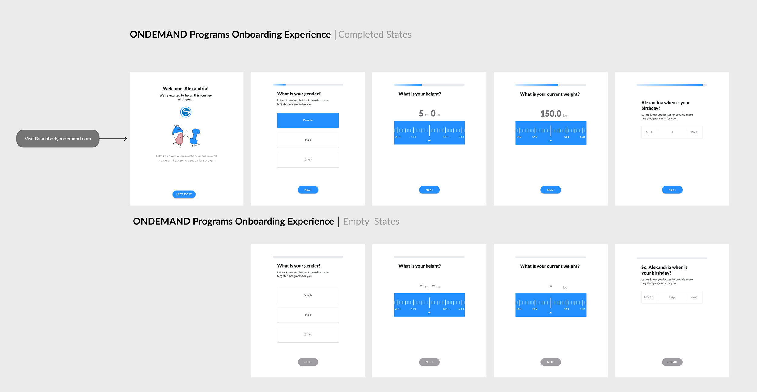
I reviewed onboarding experiences from brands similar to ours to better understand user expectations, behavioral patterns, and personalization approaches. By analyzing key flows, features, and recommendation strategies, I observed how these platforms guide users, communicate value early, and maintain clarity throughout onboarding. Platforms reviewed included Care/of, Duolingo, Caliber, Canva, Noom, and others.
At the same time, Beachbody was moving toward a more unified ecosystem across offerings such as Team Beachbody and Beachbody On Demand. While this research did not directly drive unification decisions, brand consistency and cohesion were kept in mind throughout the analysis. In parallel, I reviewed internal program flows alongside competitor onboarding and recommendation experiences to remain aligned with ongoing consolidation efforts and to avoid introducing fragmented user experiences..

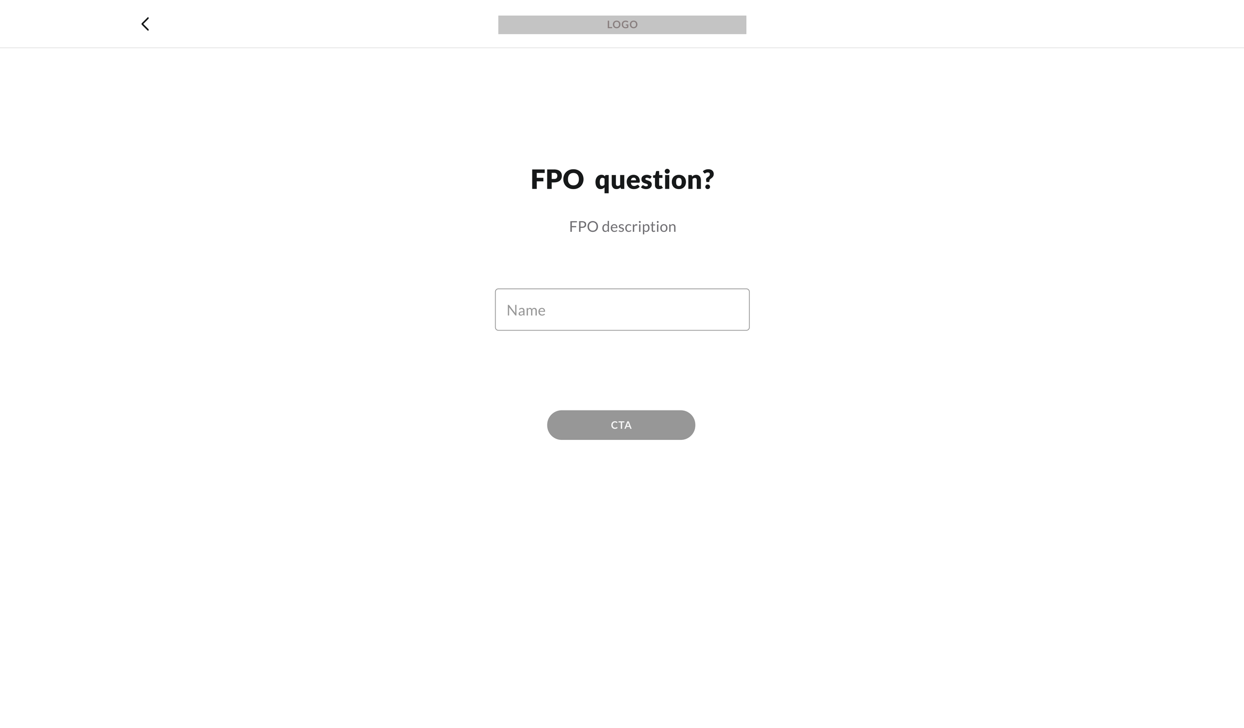
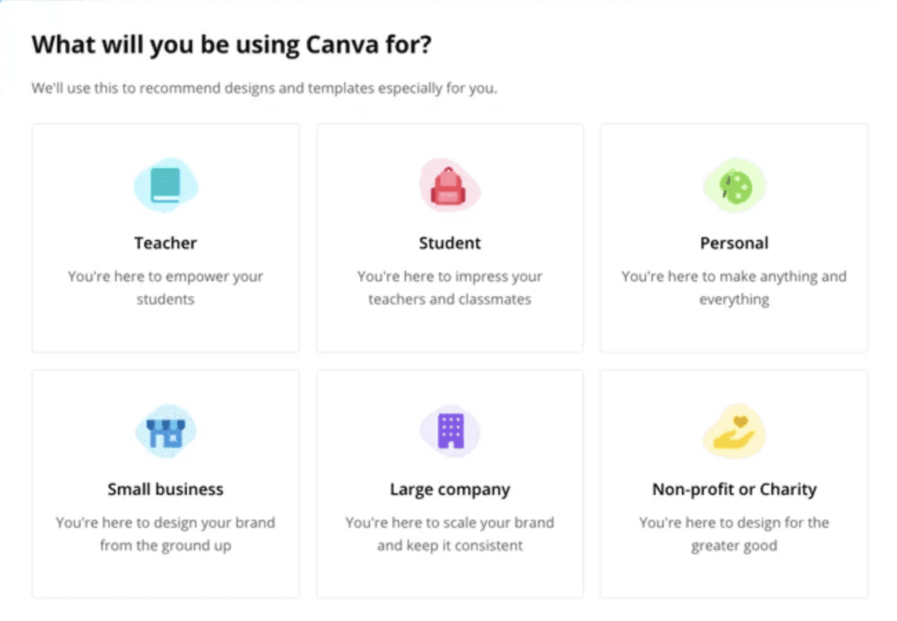
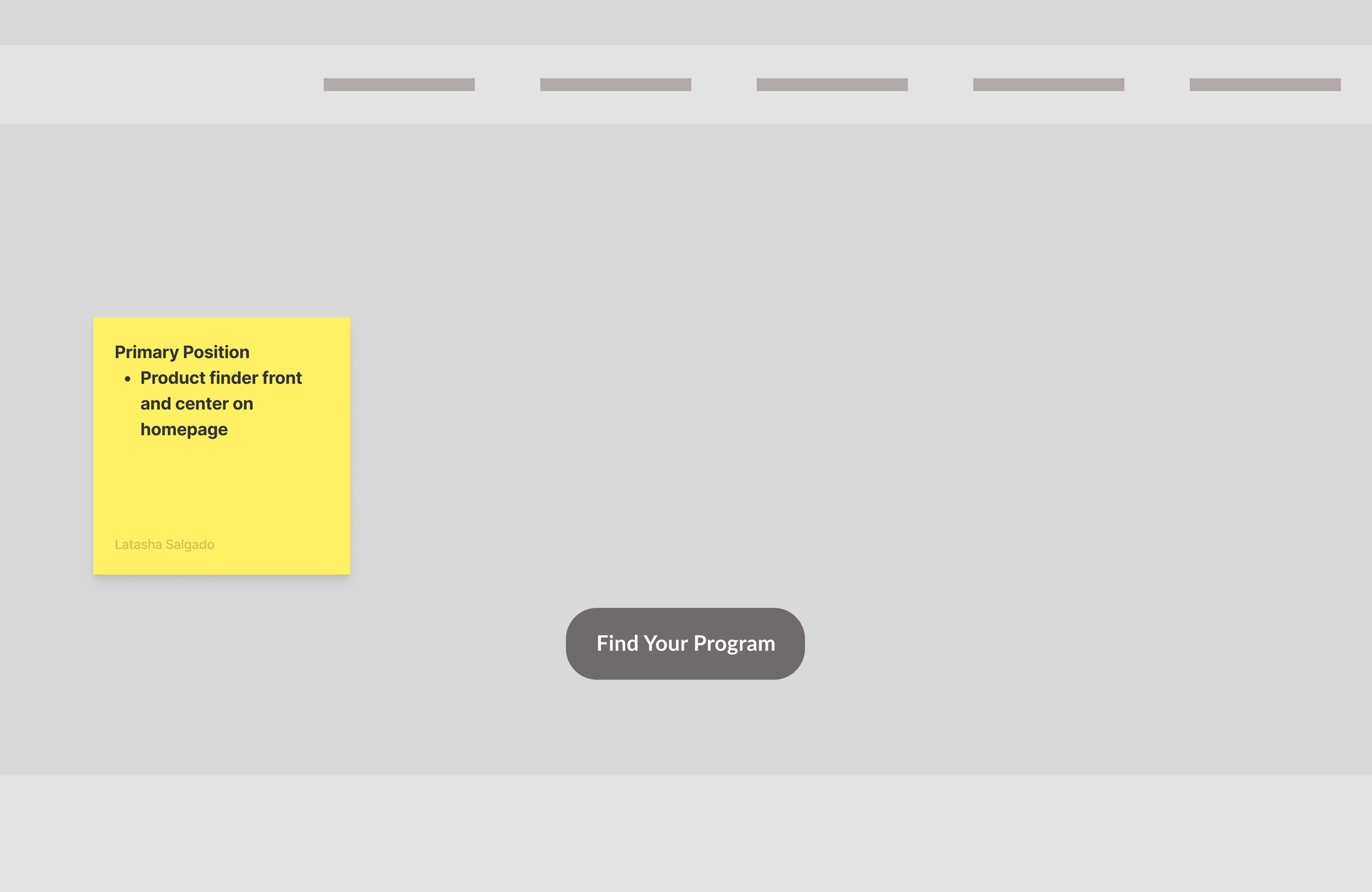
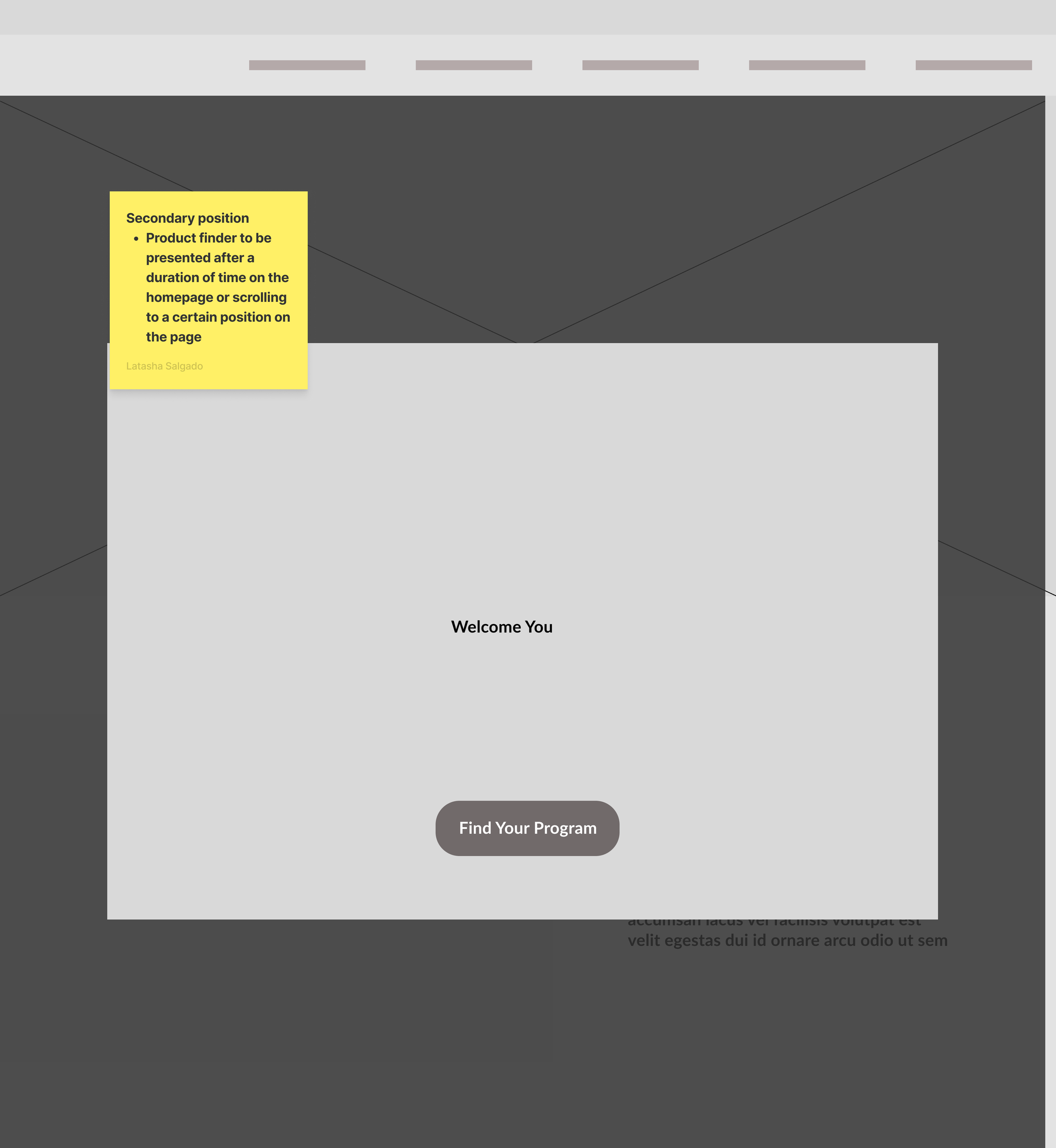
Proposal for an Enhanced User Experience
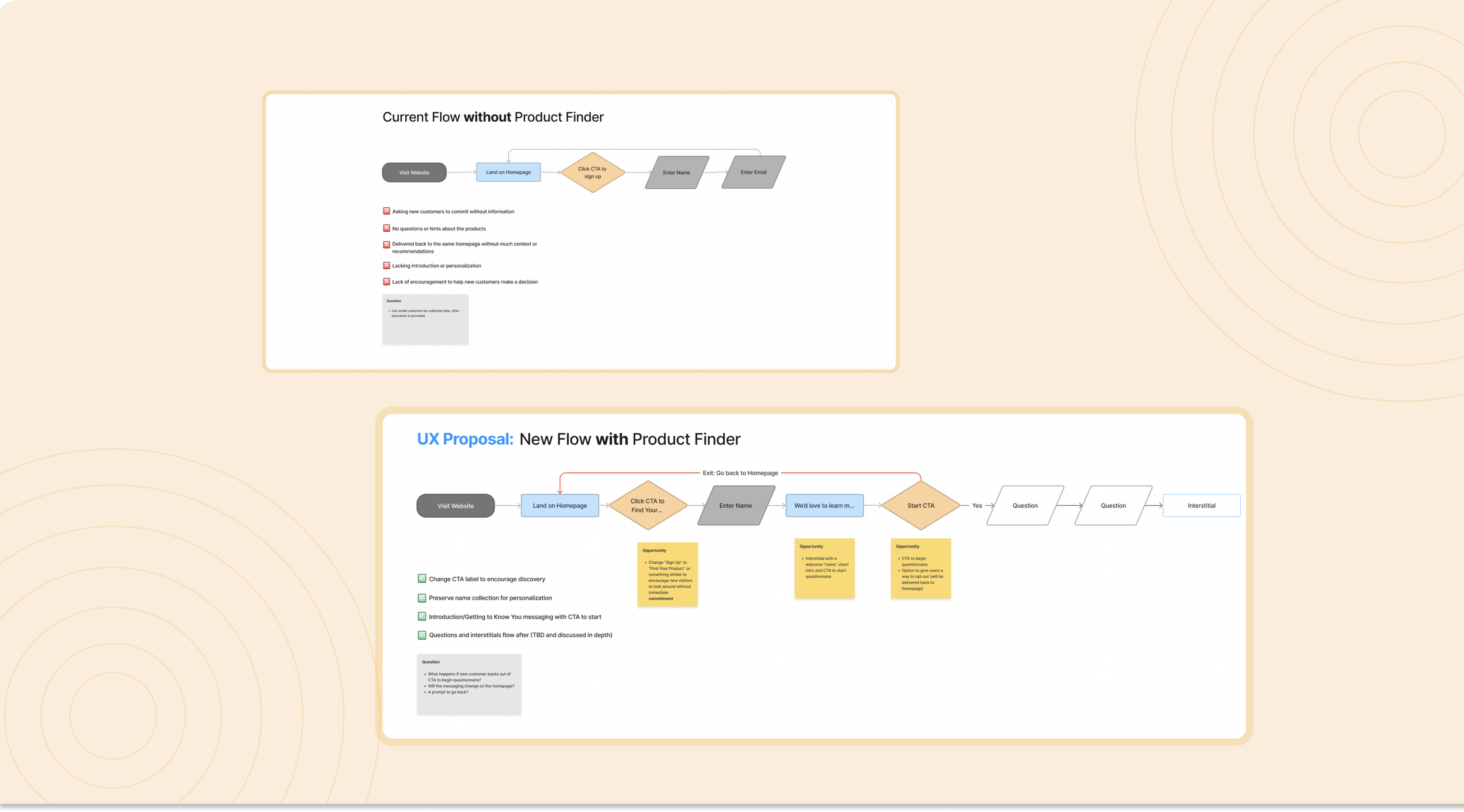
After evaluating existing entry paths for new customers, I identified key points of friction and outlined opportunities to improve early guidance and clarity. This resulted in a detailed proposal recommending alternative entry points for a Product Finder and a more intentional onboarding experience.
During reviews, the Commerce team raised concerns around email collection placement and the prioritization of the Product Finder. I advocated for emphasizing customer education early in the journey and reducing premature commitment before users understood the value of the offerings. This framing helped shift the conversation, and the team expressed openness to further exploring this approach..
Business Goals & Scope Refinement Sessions
Before moving into wireframing, I collaborated with Commerce, Marketing, and cross-functional partners to align on strategy, constraints, and design considerations. These discussions helped ensure that early design decisions were informed by both user needs and business priorities.
Following research, flow reviews, and an assessment of solutions used across other areas of the business, several key topics surfaced. The conversations were constructive and clarifying, resulting in shared understanding and clear direction, which allowed me to confidently move forward into wireframing..

Lo-Fidelity Wireframes & Collaboration
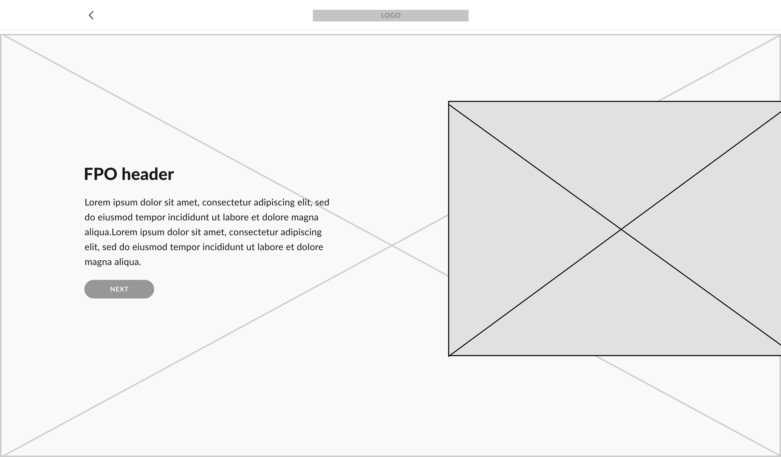
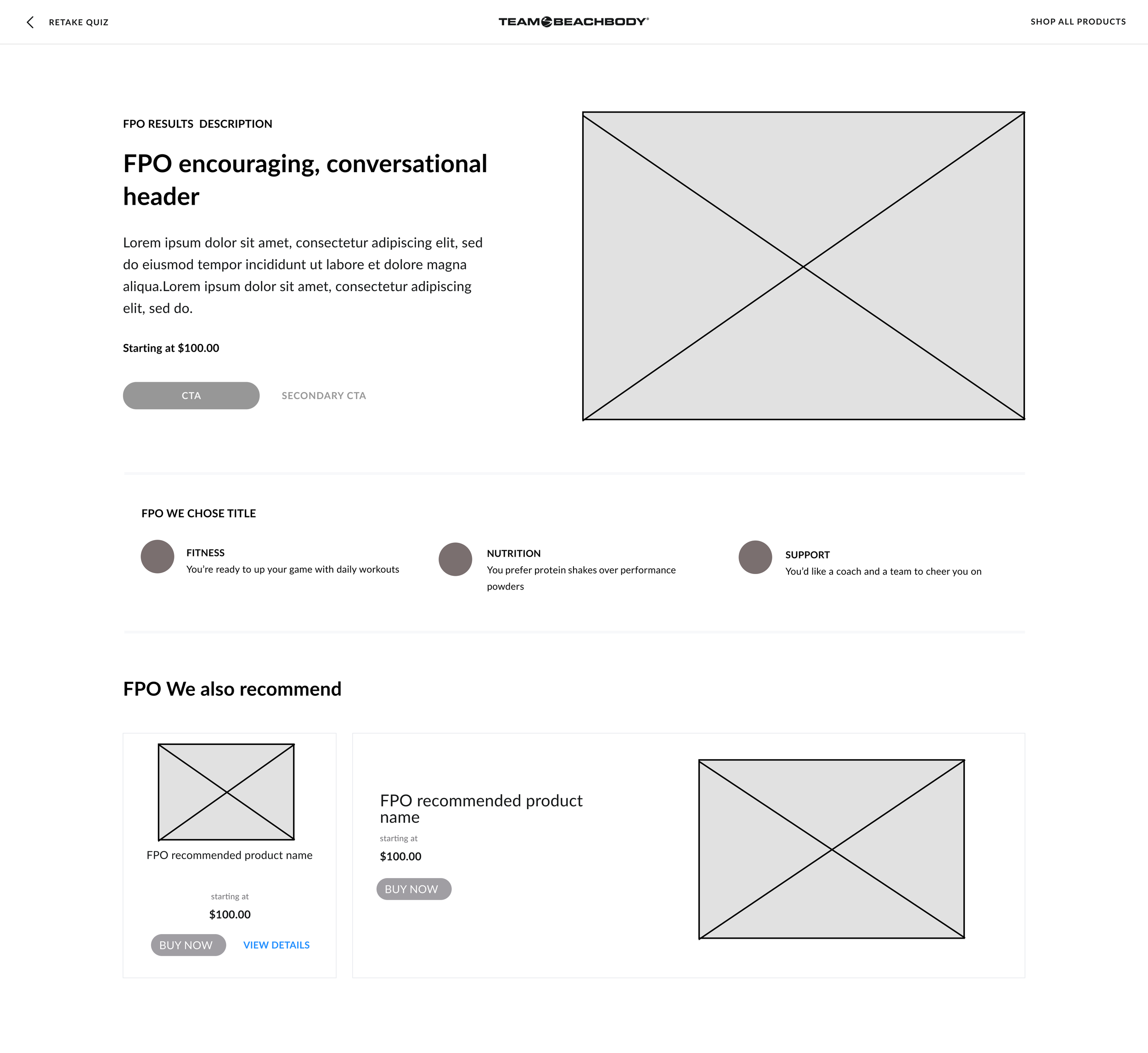
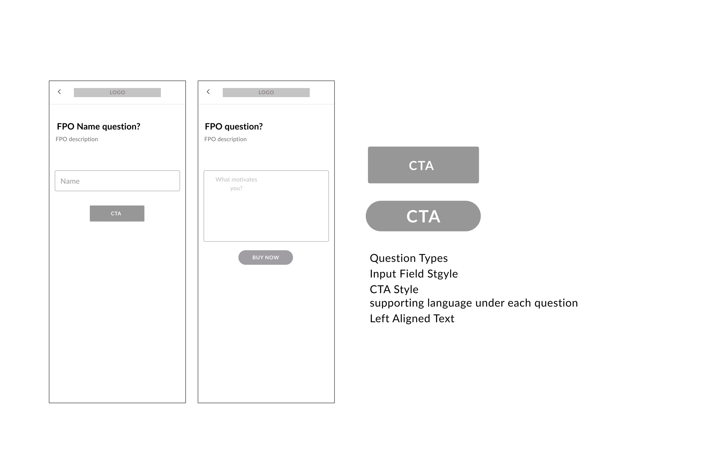
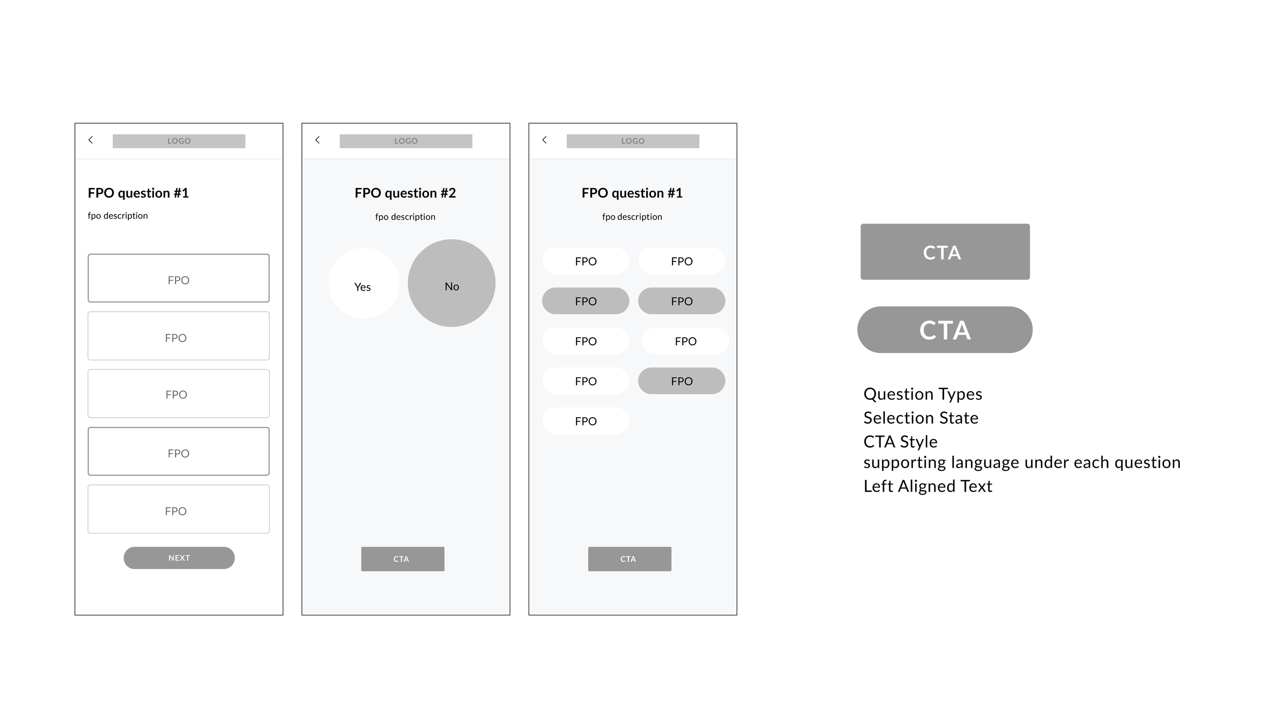
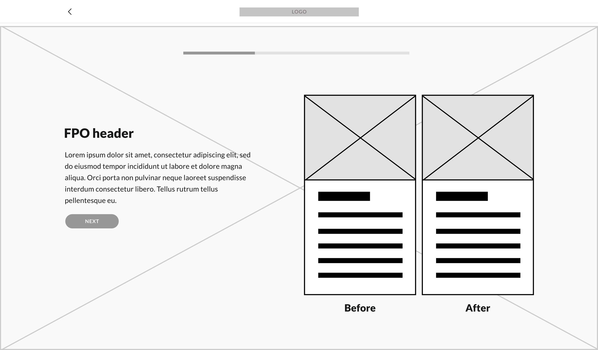
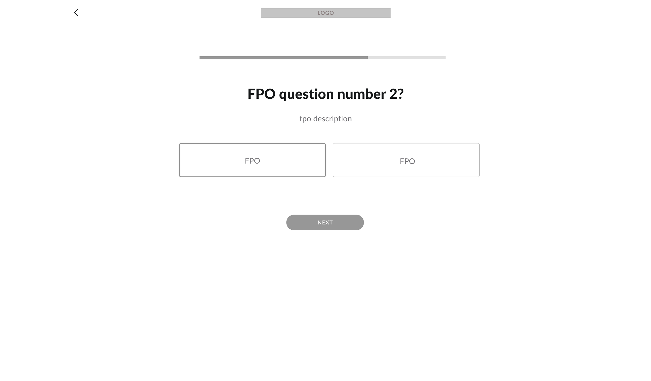
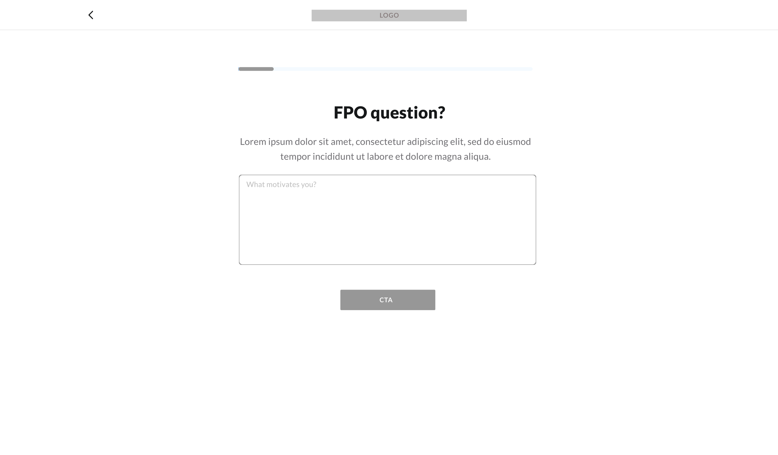
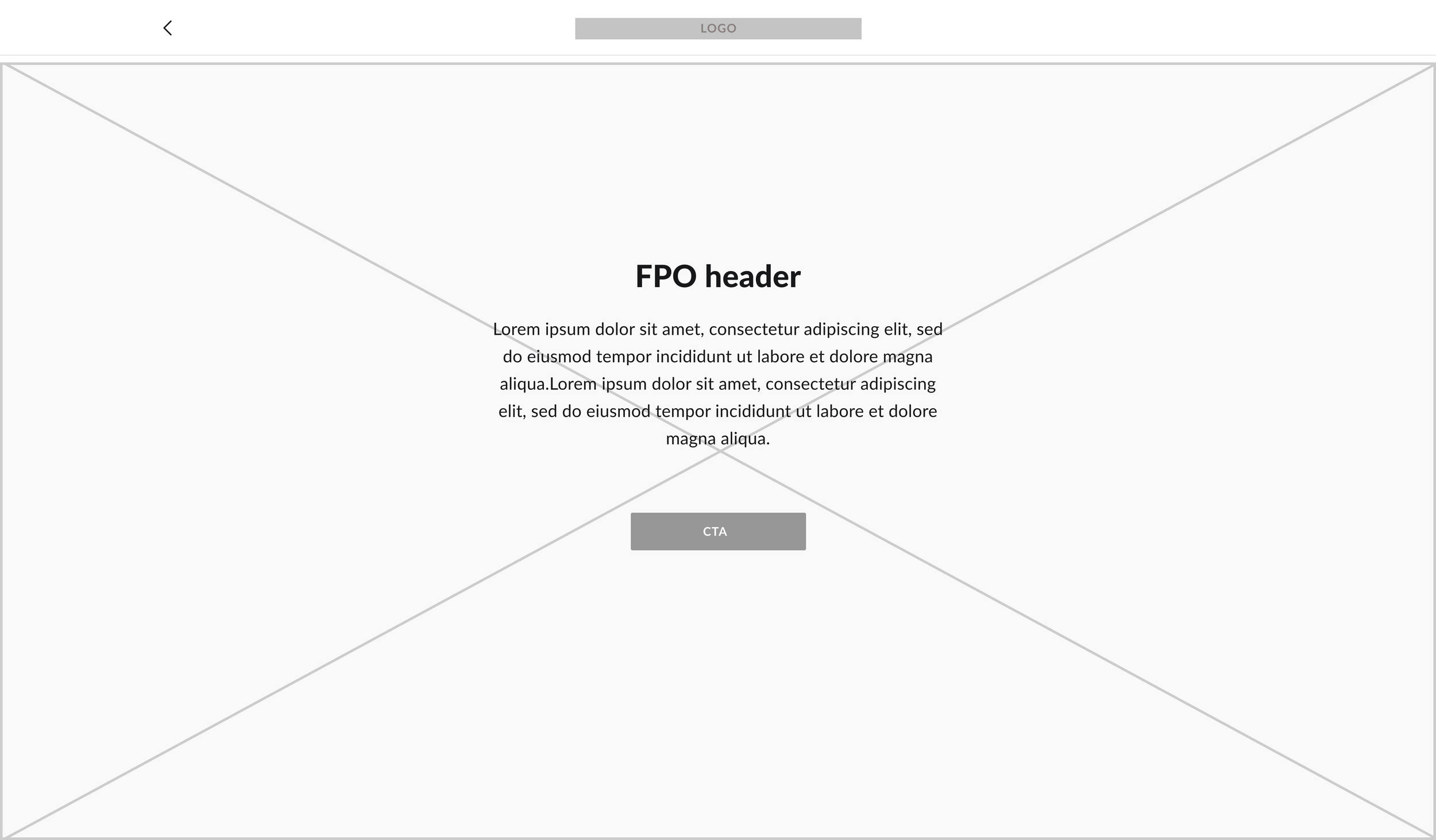
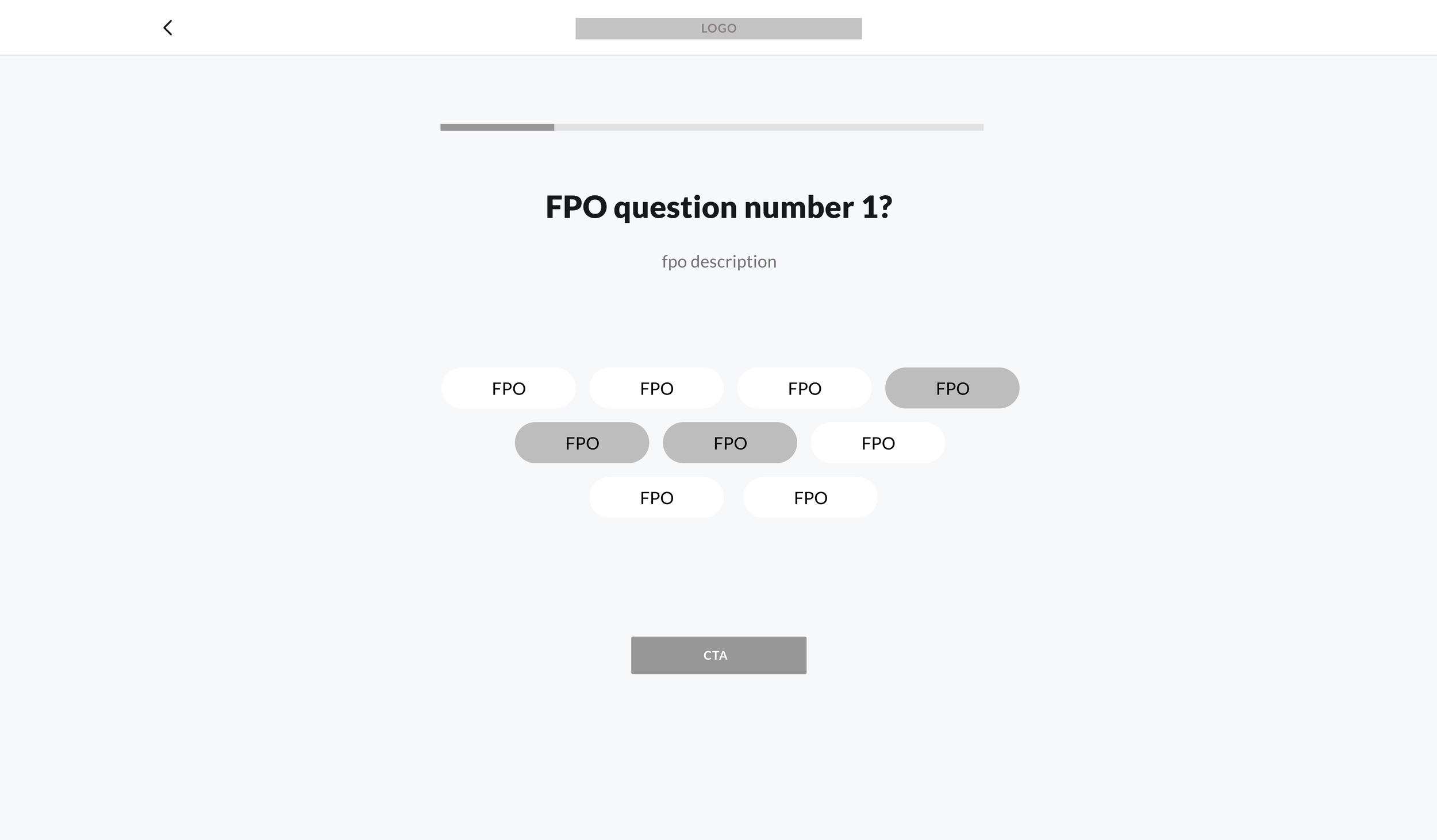
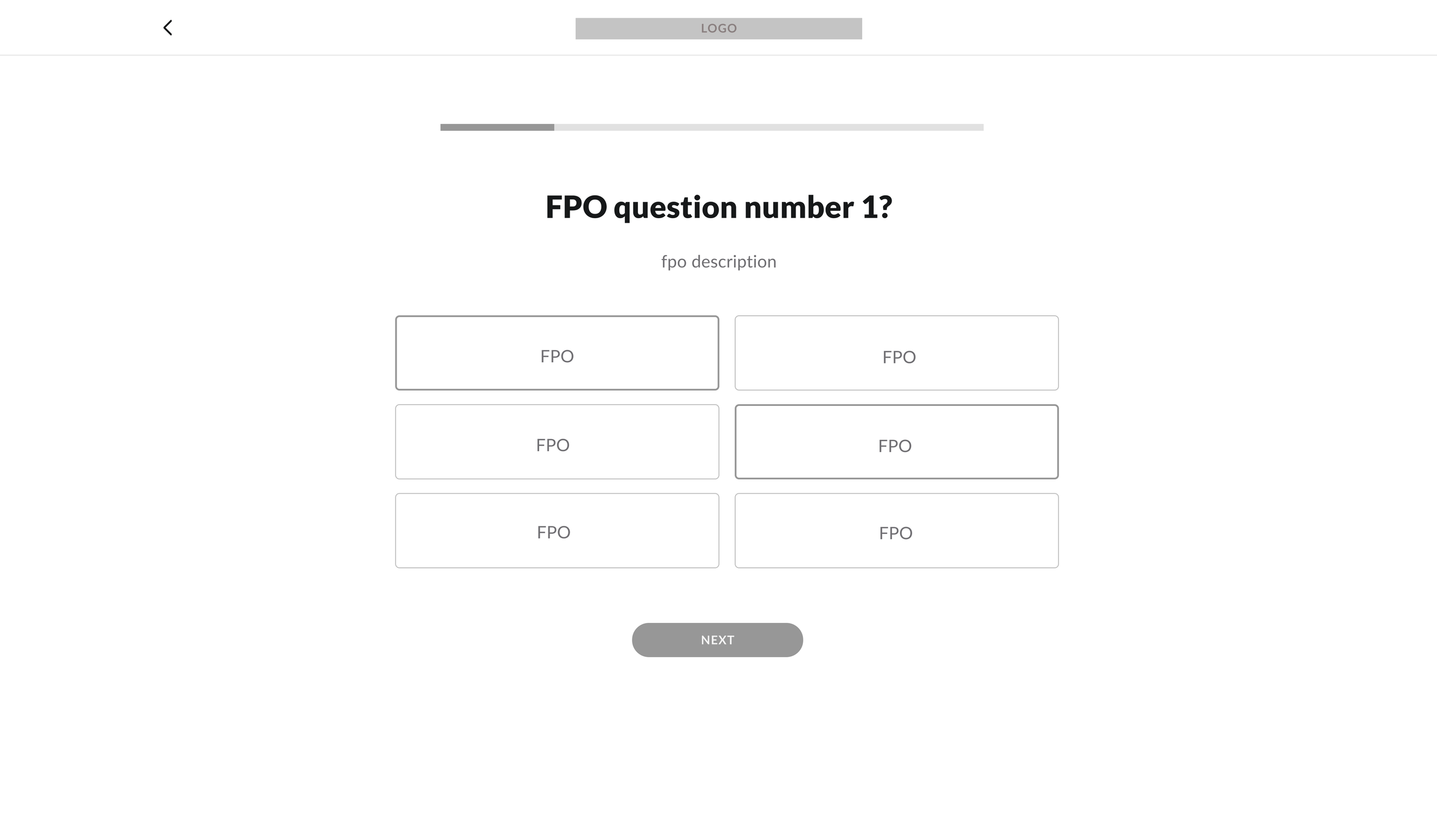
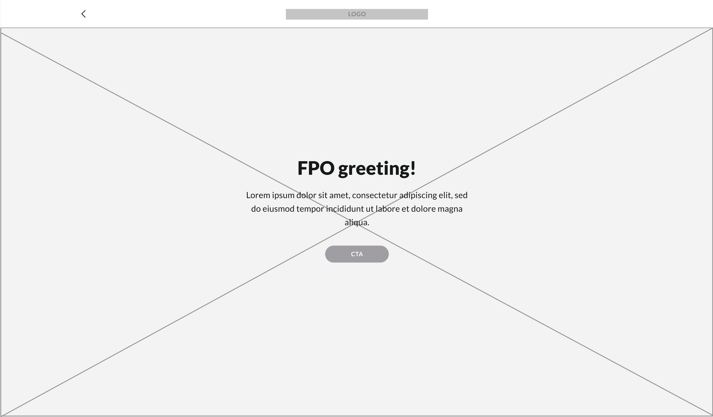
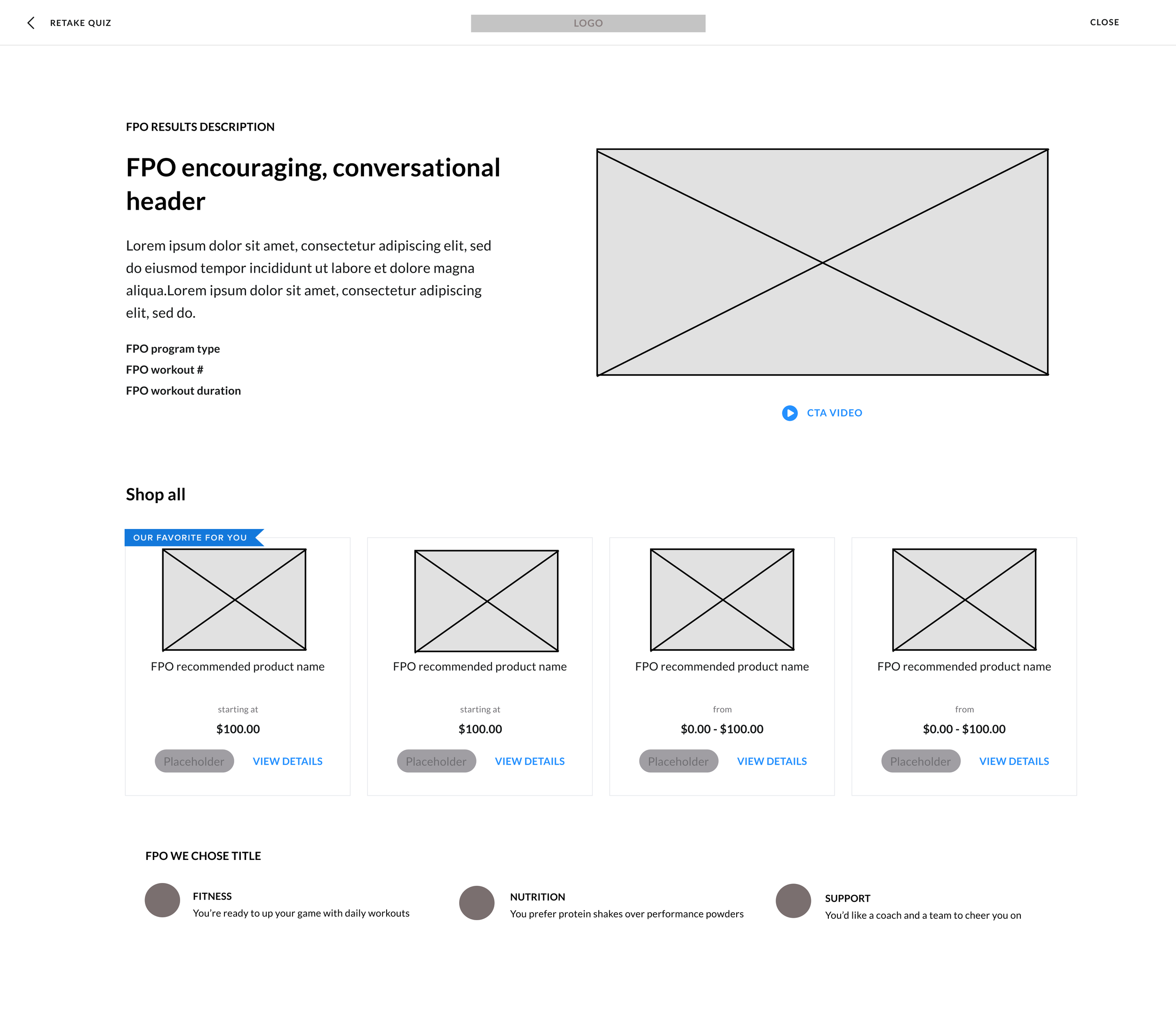
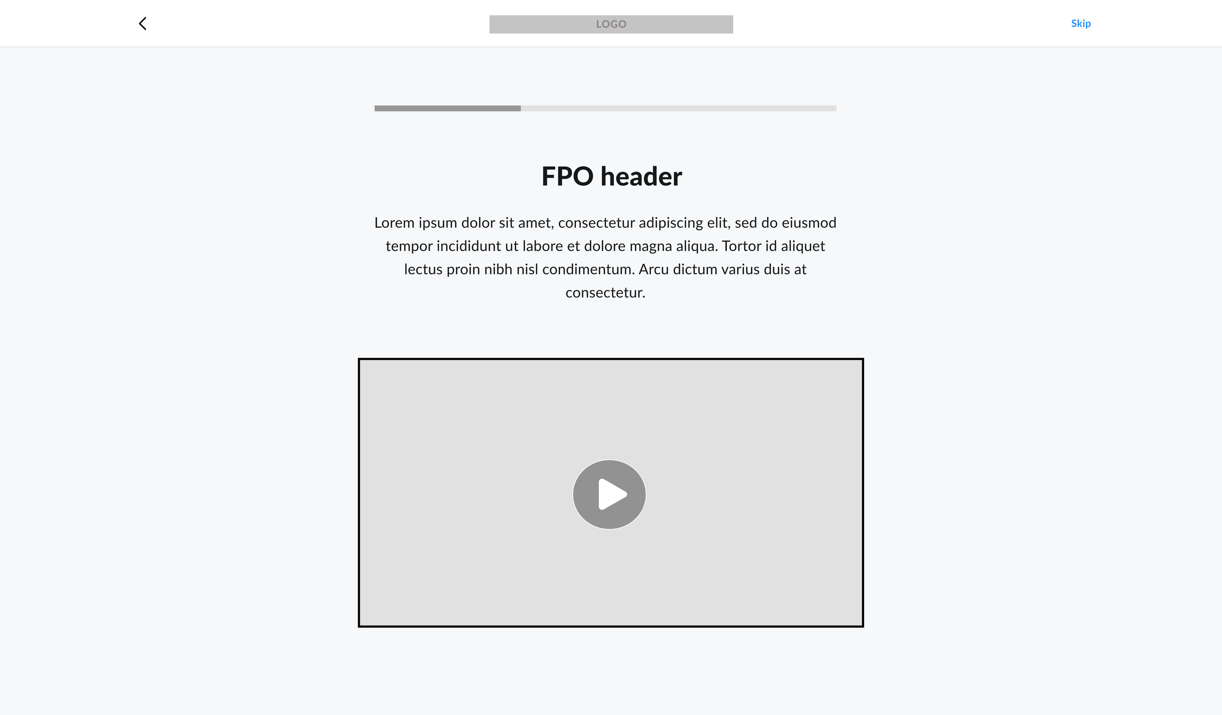
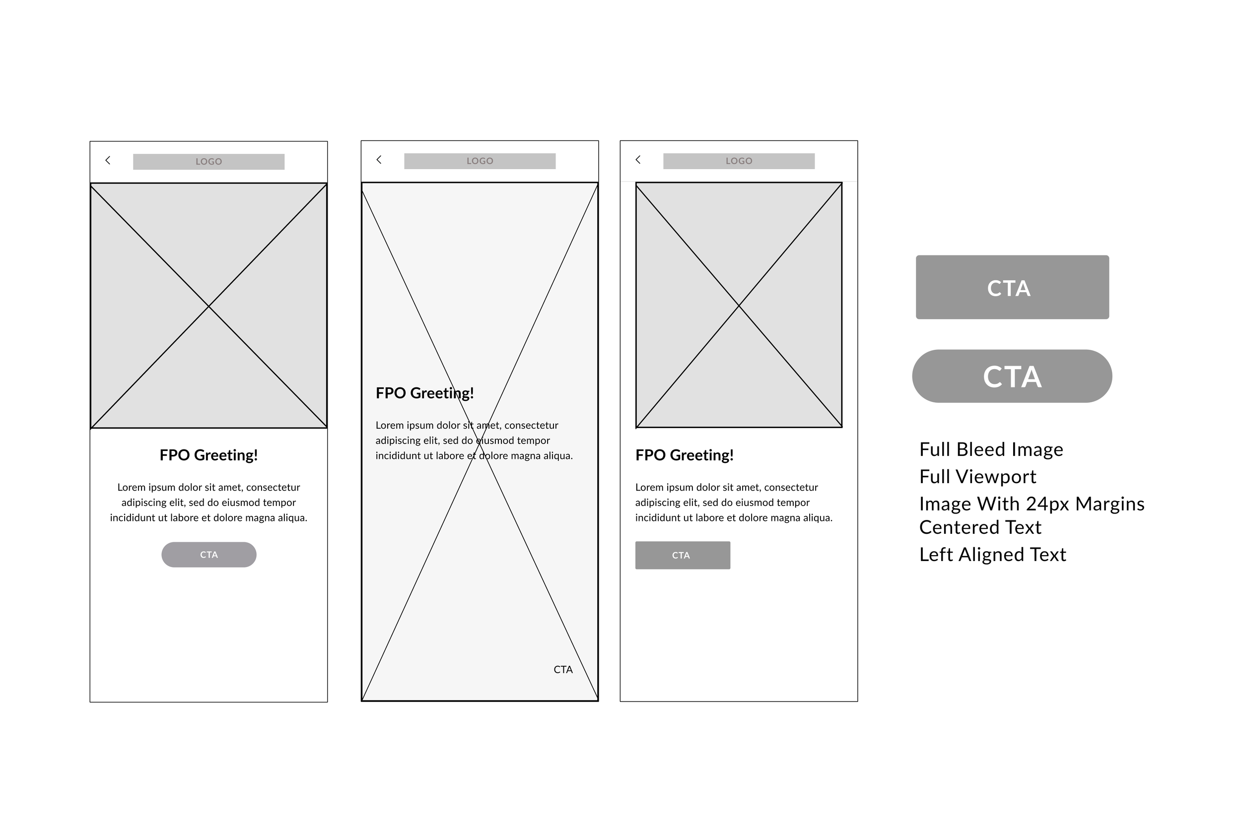
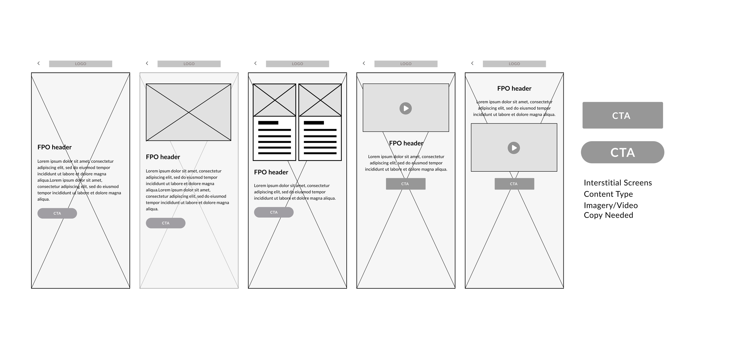
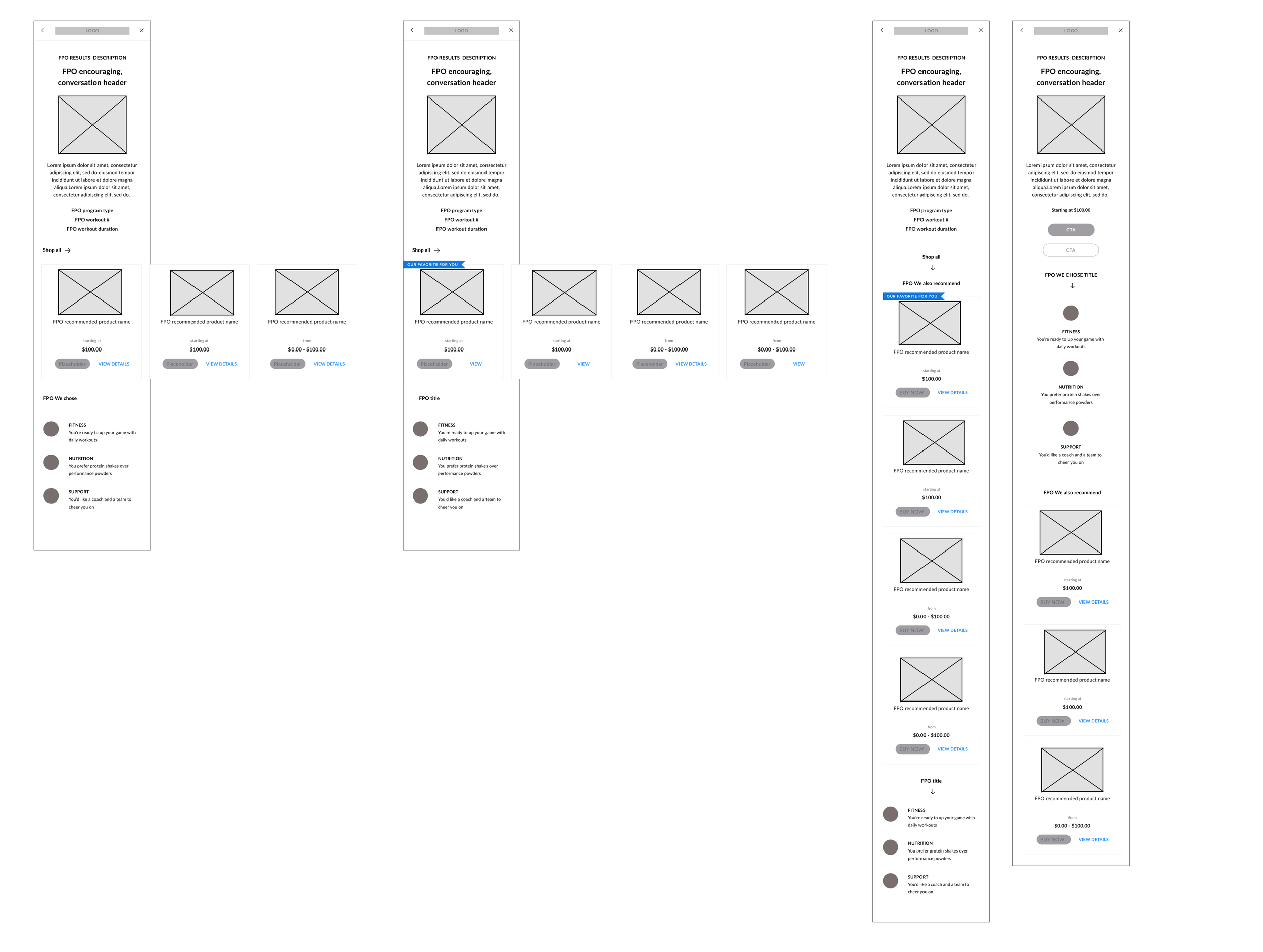
I created low-fidelity wireframes to guide cross-team discussions and collect early feedback. In collaborative sessions, we explored key elements including page hierarchy, navigation placement, CTA labeling, question order, content flow, functionality, language, imagery, and the purpose of each screen. This also included interstitials designed to provide brief, intentional pauses in the flow.
The wireframes served to answer questions such as:
What actions are possible on this screen?
What is the primary purpose of this interstitial?
Does the question sequence feel logical?
What content should appear on this page?
Does the experience support our unification goals?
This review encompassed both web and mobile experiences.


Understanding New Customer Needs
I revisited the existing user experience with a focus on what would help new customers feel confident and motivated when arriving at the homepage. To support this, I created diagrams to map key considerations and identify gaps in the early journey.
I met regularly with the Commerce team to review findings and share UX proposals for a Product Finder and lightweight onboarding experience. In parallel, we aligned on business goals and clarified project scope, as initial requirements were loosely defined. This collaboration helped establish a shared understanding of priorities and constraints before moving into solution design.


High-Fidelity Comps & Final Walkthrough
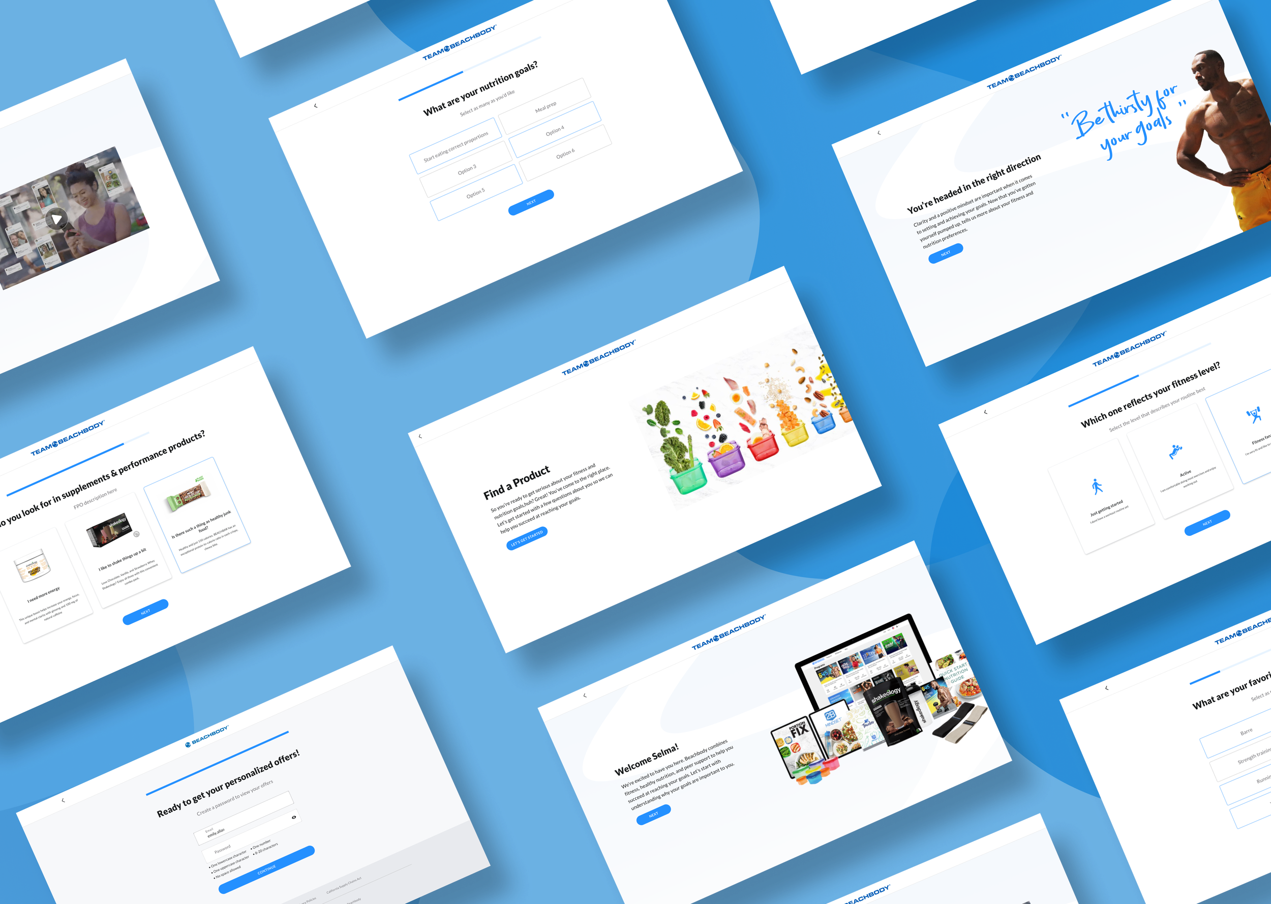
After multiple workshops and iterations, I developed an interactive prototype for the fully realized Onboarding + Product Finder feature. The prototype incorporated branding, visual style, and intended functionality, and was presented to Stakeholders, Commerce, and Product Design. Feedback was overwhelmingly positive, with a few minor adjustments requested:
Simplifying CTA labels
Replacing certain imagery with trainer and video content
Adding additional nutrition-related questions
Scope Pause
During this phase, the project was temporarily paused due to scope considerations. With multiple commerce initiatives and upcoming program launches, Stakeholders decided to delay the feature to ensure the recommendation engine could fully support all new and existing offerings. Contributing factors included:
Exclusion of the Product Detail Page, requiring additional alignment on program releases
Requests to add new program-related questions despite limited information
Urgent priorities from Commerce impacting scheduling
Despite the pause, the process allowed us to validate the prototype, refine the experience, and position the feature for a smooth development phase once timing aligned.
Below are some of the final screens for the Product Finder + Onboarding feature
Project Overview
The Team Beachbody project focused on improving the commerce experience to better support user engagement and conversion. As part of this effort, several areas of the experience required updates. My initial focus was on new visitors, where the opportunity was to reduce friction and uncertainty by introducing a Product Finder to help guide users toward relevant programs and offerings.
01


Quick Wins Across Experiences
Delivering Multiple Improvements
Several high-priority initiatives required rapid delivery within our experience, including final designs for web and mobile areas such as Offers, Preferred Coach/Customer pricing, and PC SKU Promo Banners at Checkout. Additional initiatives—visible further down in this case study—were also addressed in parallel, demonstrating the breadth of improvements delivered.
I quickly produced final screens and handed them off to developers for implementation within a tight two-week timeframe. Throughout development, I collaborated closely with the team, participating in User Acceptance Testing (UAT) and demos to ensure design integrity and a smooth user experience.
Even with an expedited process, the project maintained fidelity to insights from prior Kickoff, UX Discovery, Research, and Design phases, allowing us to deliver meaningful, high-impact improvements across multiple areas of the experience.
Transparent Pricing Design
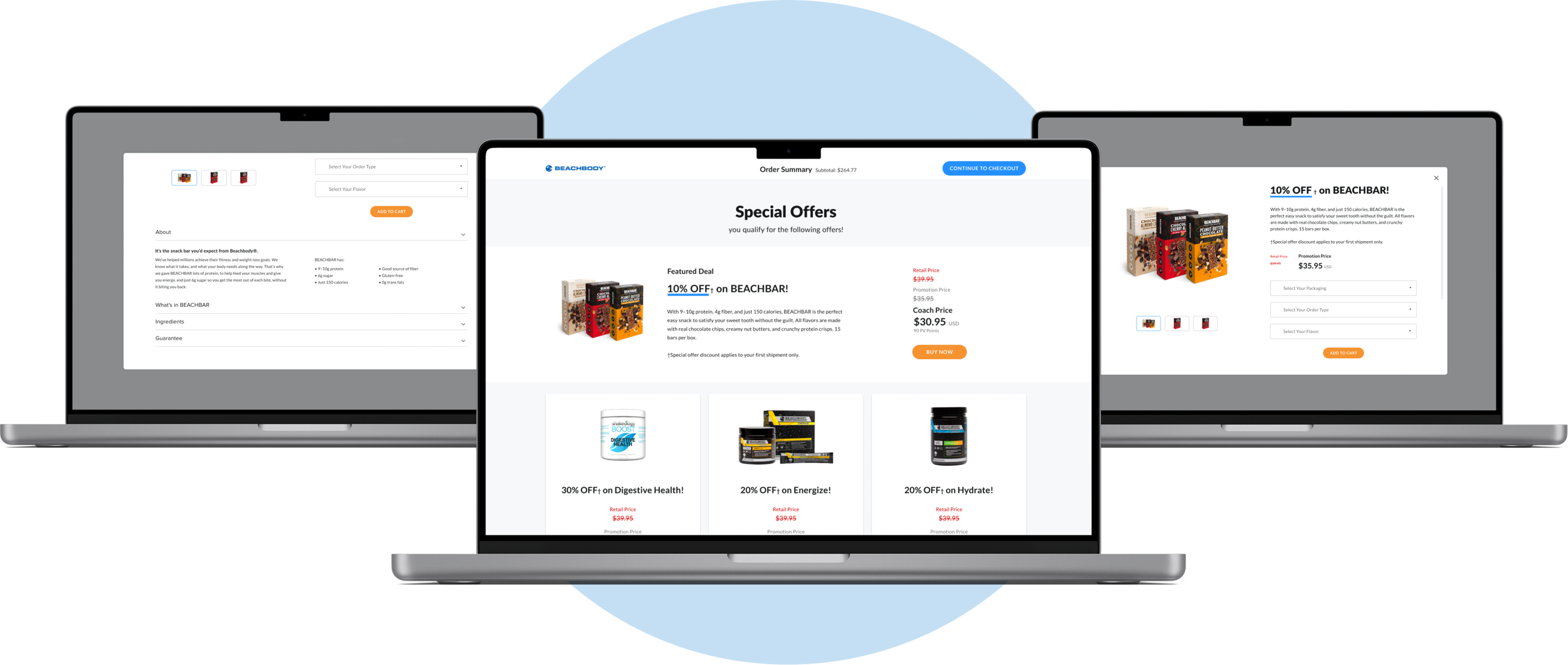
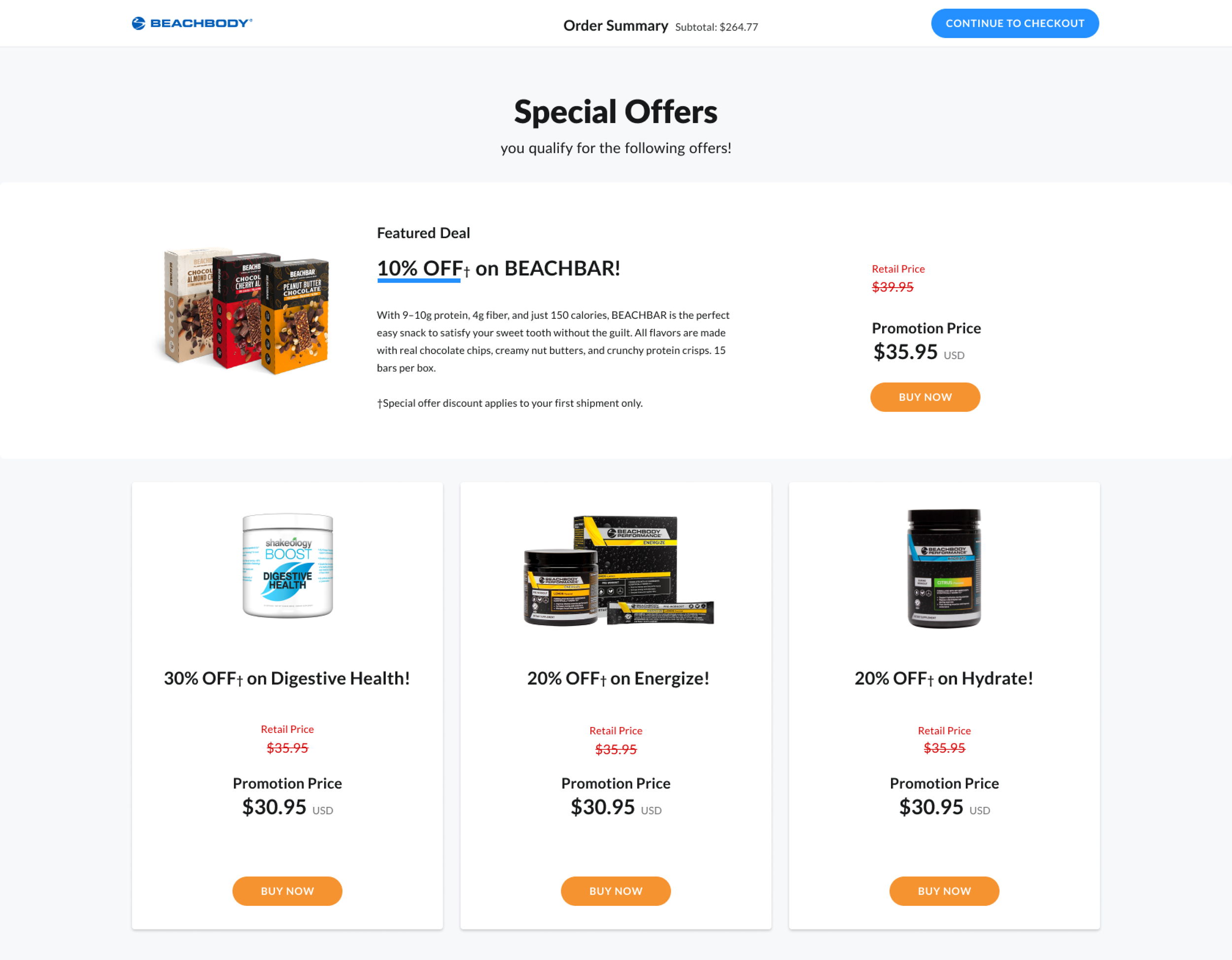
Customers needed a clear and consistent way to view discounted retail offers, Coach pricing, and Preferred Customer pricing.
I designed the Special Offers page and product modals using a straightforward stacked hierarchy. Incorporating strikethrough pricing enhanced visual clarity and quickly communicated discounts.
Outcome: Customer and coach feedback confirmed the updated pricing structure was logical, user-friendly, and easy to understand..

Checkout Form Redesign
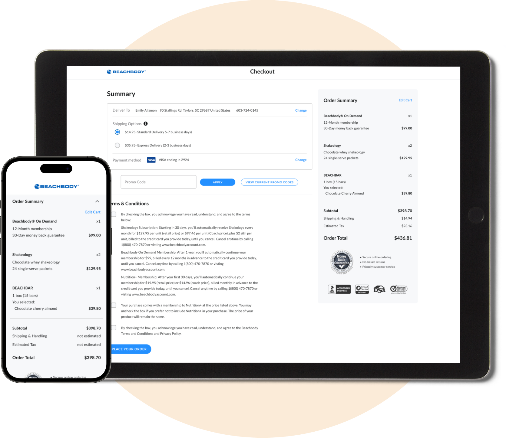
The checkout form was overly long, spanning three mandatory sections for customers to complete.
I redesigned the form using best practices and our updated design system, updating input fields, radio buttons, and primary, secondary, and tertiary buttons for clarity and efficiency.
Outcome: The new design streamlined completion, improved navigation, and accelerated the checkout process. Abandonment rates dropped from 55.45% to approximately 20% (numbers adjusted slightly for confidentiality), demonstrating a significant recovery of abandoned carts.

Reflection
I am deeply passionate about e-commerce and committed to building a meaningful, long-term career in this dynamic field. Leading cross-functional collaboration with Commerce, Marketing, and project teams has been particularly rewarding, enabling impactful results through shared vision and teamwork.
True success, I’ve found, comes from aligning around common goals and fostering open, solution-focused collaboration. Balancing effective time management with agility to pivot when priorities shift has been essential to delivering value.
I’ve also learned that scope adjustments and scope creep, when approached strategically, become opportunities to refine project direction and strengthen outcomes. Pushback, likewise, is not an obstacle but a catalyst for growth—reinforcing the importance of championing strong UX foundations and thoughtful design innovations.
To my former teammates at Beachbody: thank you for your support and collaboration—it has been instrumental in my professional growth..
BANNER PC SKU
Preferred Customer Membership Banner
The design request focused on adding a Banner for the Preferred Customer (PC) Membership SKU on the shopping cart page.
While the option to add the PC SKU existed, we needed functionality to add or remove it, along with a confirmation prompt. Collaborating with Product, I conducted light research and crafted microcopy for the Banner and Confirmation Modal, emphasizing the CTA to encourage membership retention. I also partnered with the Design System manager to assess existing Banner and Alert components, creating new elements tailored for commerce use.
Outcome: The remove functionality was successfully implemented, and we observed an increase in customers retaining their memberships. Feedback suggests the informative modal and clear language positively influenced user decisions and confidence..


REVAMP CHECKOUT FORMS
